reflections

Japan: Modern exhibition

Today I reflect on a few aspects of a catalogue that accompanied the exhibition Japan: Modern. Japanese prints from the Elise Wessels Collection.

Even though I didn’t have the time to see the original prints at the Rijks Museum in Amsterdam last year, I did manage to buy the catalogue from the museum store. (Museum stores are great places to find all manner of superb books).

I have been a fan of Japanese aesthetic and culture for quite some time and I was delighted to read (and see) during my research that Jon McNaught, an illustrator of whose work I became fond of and have outlined in a different post, talks about his early fascination with Japanese printmaking. But of course, it goes without saying that Japan has been an important source of inspiration for many people.

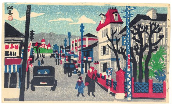
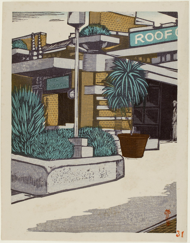
The show introduces Japanese printmaking from the first half of the twentieth century, with the emphasis on the first three decades. The experienced rapid growth of industrialization and modernization, caused great changes in landscapes and social relations. Artistic expression of the emotional responses is represented by two movements: sosaku hanga (creative prints) and shin hanga (new prints; contrary to the name they are basically a continuation of the classical tradition of ukiyo-e printmaking)


Some examples from the collection:
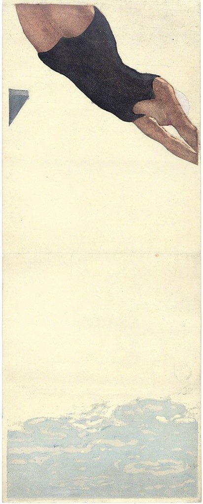
 

Onshi Koshiro, ‘Diving’, 1932


Kawanishi Hide, ‘Towa road’


Henmi Takashi. From the series ‘One Hundred Views of New Tokyo’


Uehara Konen, DŌTONBORI


Both movements used the same medium but had very different ideas about application, artistic practice and choice of theme. The more conservative shin hanga artists would work under a publisher’s supervision, rendering highly refined products and depicting traditional themes such as the female portrait and atmospheric landscapes. Sosuka hanga artists promoted the idea of an artist as being in charge of the print’s production steps, which often resulted in a more crude outcome with less details. They focused on their immediate surroundings and daily life as motifs.

In reality the distinction between both movements was not as strict. Often artists would create templates for a publisher and would then also be responsible for the printing process.

My reading up about this part of art history and about artists’ sources of inspiration is like tracing back a dynamic chain reaction being in constant movement. It is fascinating to actually see the influences of Japanese “art”, seen as it wasn’t even considered as art in Japan when these prints became hugely popular in the Western world. One of the most famous and obvious examples on how influential these Japanese visual techniques were, is some of Vincent van Gogh’s work.

The van Gogh museum’s website renders this aspect beautifully: Meet Vincent. Inspiration from Japan

Van Gogh Museum (2017) Meet Vincent. Inspiration from Japan. [Online] Available at: https://www.vangoghmuseum.nl/en/stories/inspiration-from-japan [Accessed: 11 December 2017]


Jansen, M. (2016) Japan: Modern. Elise Wessels Collection published on the occasion of the exhibition at the Rijks Museum, Amsterdam: June 24 – September 11, 2016. Amsterdam: Rijks Museum

Rijksmuseum (2017) Japan: Modern. Elise Wessels Collection [Online] September 2016. Available at: https://www.rijksmuseum.nl/en/japan-modern [Accessed: 11 December 2017]
 

To illustrate is to make decisions

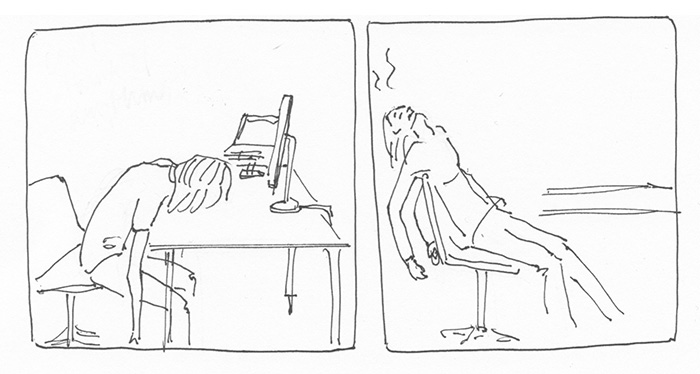
I can’t think of anything, A. Shemilt


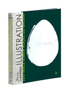
In this post I reflect on a paragraph I read the other day and that is still resonating with me. It is an excerpt from the book Illustration – 100 ways to draw a bird by Felix Scheinberger. Unfortunately it is currently only available in German, but I will do my best to translate the mentioned paragraph.


“Ruminating and hesitating does not make you a better Illustrator. Take risks when you work. The time wasted with indecision can be used to create two bold images instead of a single, timid one. (…)

Creating means making decisions and illustrating means making one decision after another – confidently until you have reached your final result.”

Felix Scheinberger (p. 34)


Yes. True. However, it does require knowledge of the desired goal, namely what message I want to communicate, something that Scheinberger states in the previous chapter. So: What is my message, who am I as an illustrator, where do I want to get with my practice and how? Questions, that I am still in the process of answering as I proceed in my studies.

Felix Scheinberg is a contemporary German illustrator, artist, designer and professor for illustration. He is the author and illustrator of Urban Watercolour Sketching as well as several books in German on illustration, and he has illustrated more than fifty children’s books in the last decade. His work has appeared in magazines including Harvard Business Manager and Psychology Today. He teaches at the University of Applied Sciences in Münster, Germany.


Felix Scheinberger: 100 Wege einen Vogel zu malen (english:”100 ways to paint a bird”)


Scheinberger, F. (2013) Illustration. 100 Wege einen Vogel zu malen. Mainz: Verlag Hermann Schmidt


Taarika John

Taarika John is an illustrator based in Mumbai, India. I came across her work during my visual keyword research on behance.

The project that caught my eye was her Final Diploma project, where she worked with the ‘Art in Transit’ project. Art in Transit is a multifaceted public art initiative facilitated by the Srishti Institute of Art, Design and Technology and the city of Bangalore.


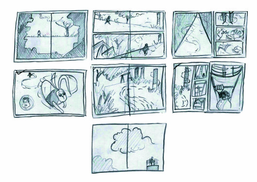
Storyboard. Taarika John
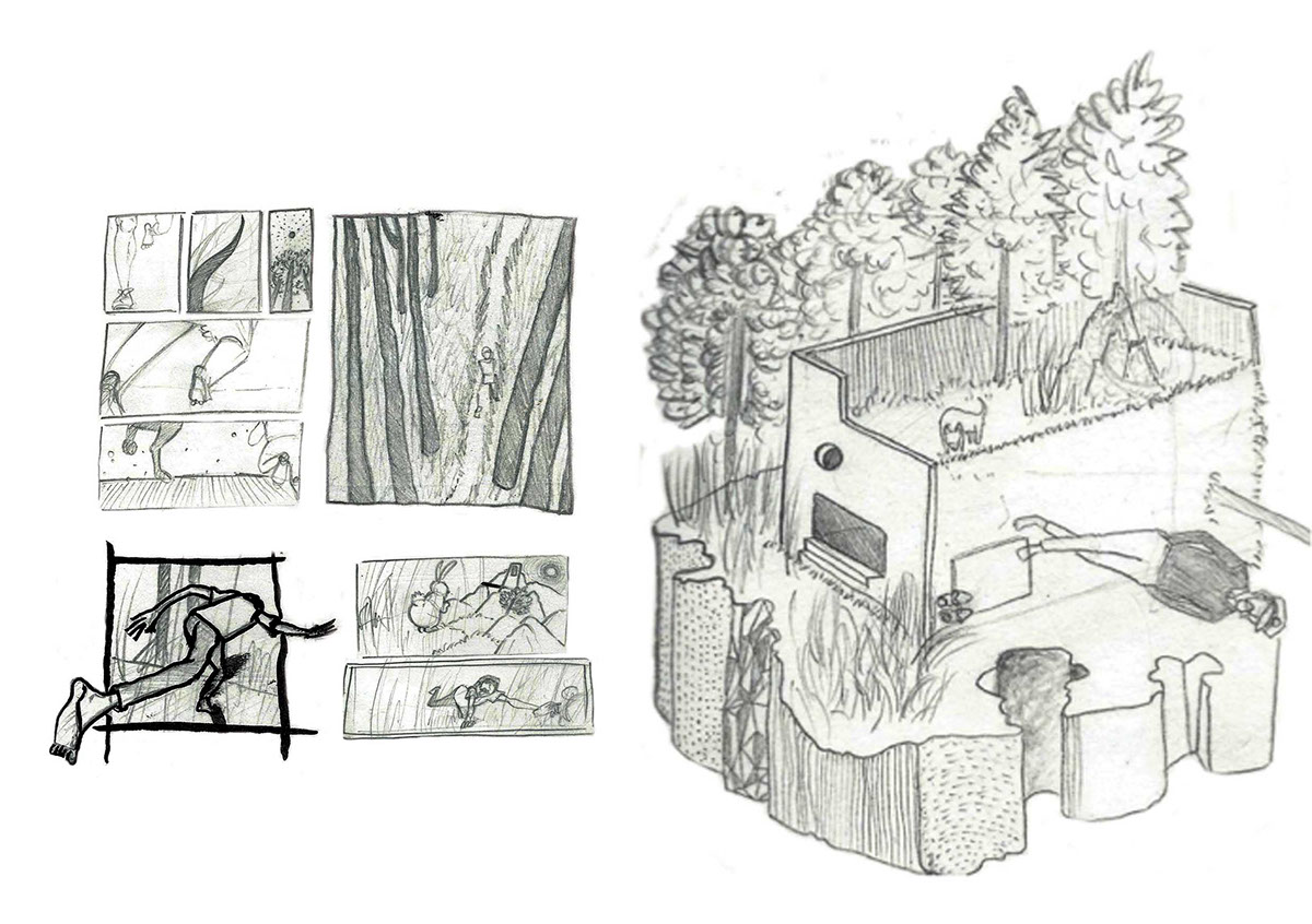
Storyboard sketch. Taarika John
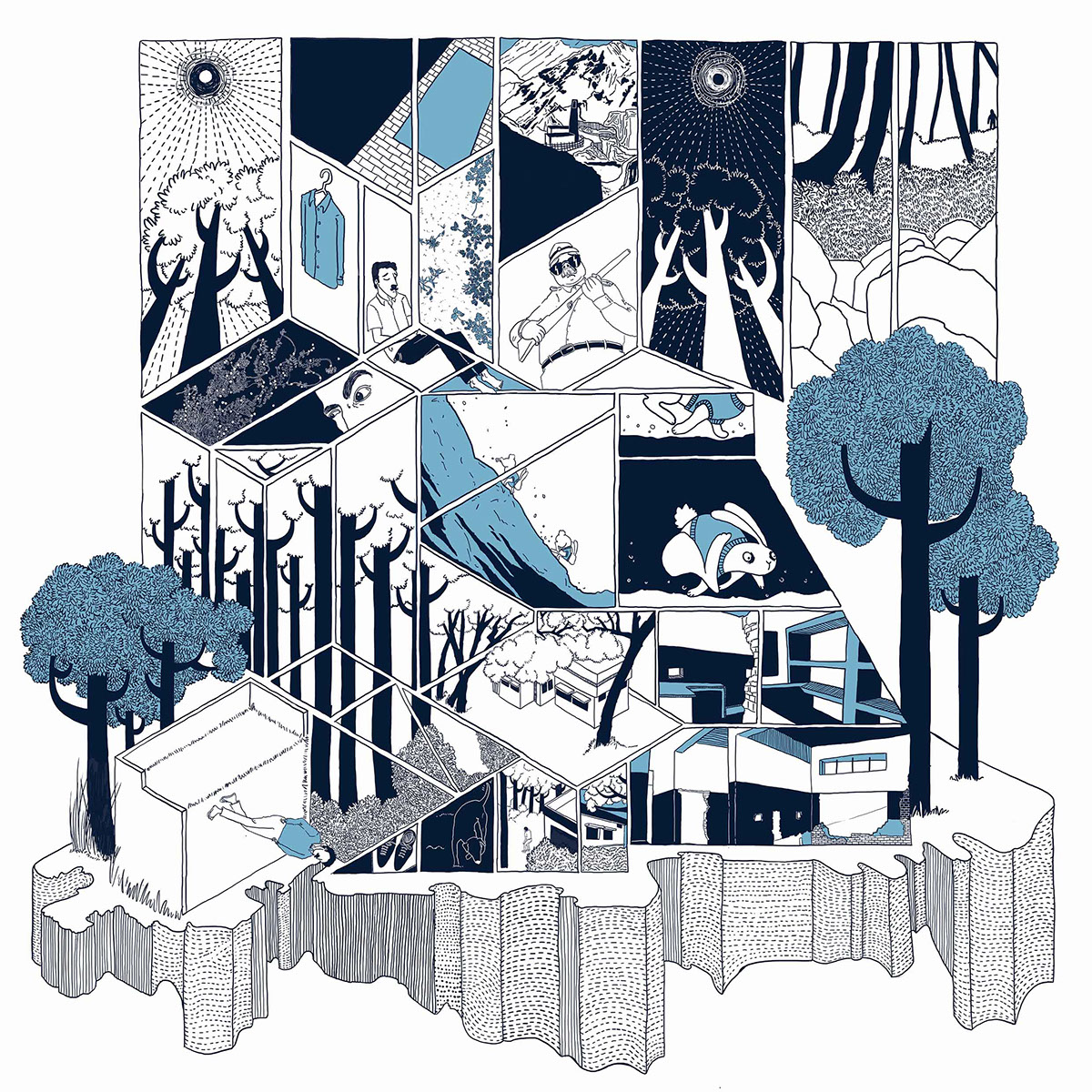
‘The abandoned plot’ Taarika John


It is fascinating to see how she visually explored the themes of monotony and routine in context of space, narratives and experiences. After mapping the area surrounding the ‘Art in Transit’ location she combined her mapping results with a fictional narrative of the non-fictional space. I think the comic convey her message very well using a multidimensional layout, depicting different perspectives and a balanced composition.


behance (2017) Manifestations of Monotomy [Online] 2014. Available at: https://www.behance.net/Taarikajohn [Accessed: 21 November 2017]

John, Taarika (2017) Taarika John [Online] 2017. Available from: http://www.taarikajohn.com/monotony.html  [Accessed: 21 November 2017]

John, T. (2015) Art in Transit [Online] Jan 02, 2015. Available from: https://mappeenya.wordpress.com [Accessed: 21 November 2017]

Art in Transit Bangalore (2017) Connecting people and city through art [Online] Available from: http://www.artintransitbangalore.com [Accessed: 21 November 2017]


Keyword outcome

Coming across Jon McNaught’s work and his creative approach inspired me to look closer into the field of ‘silent comics’. It is impressive what you can achieve in terms of mood and intimacy without a dialogue or even a plot.

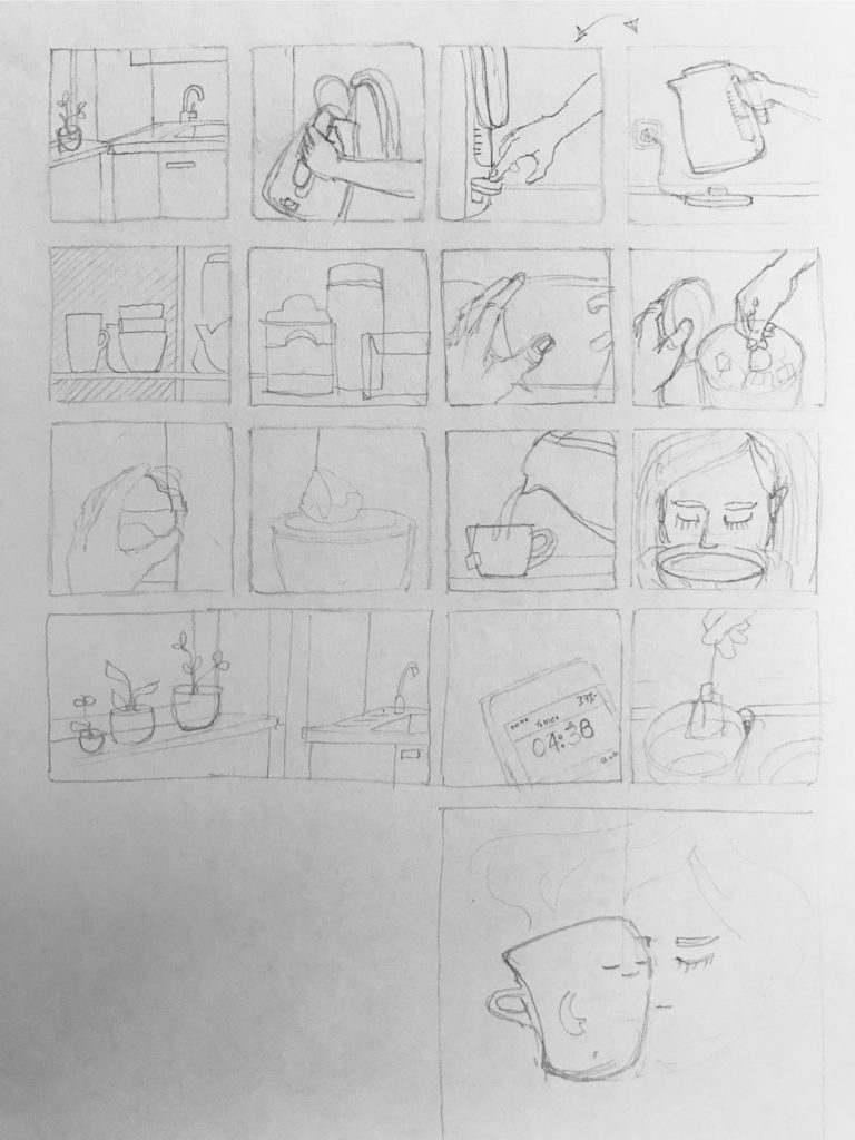
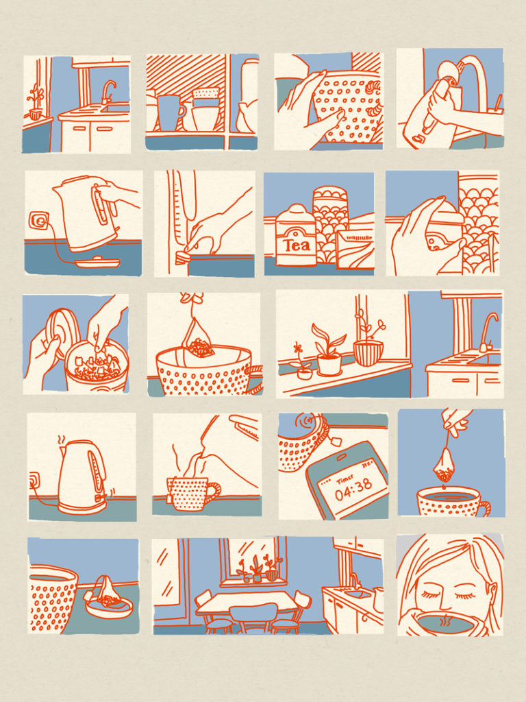
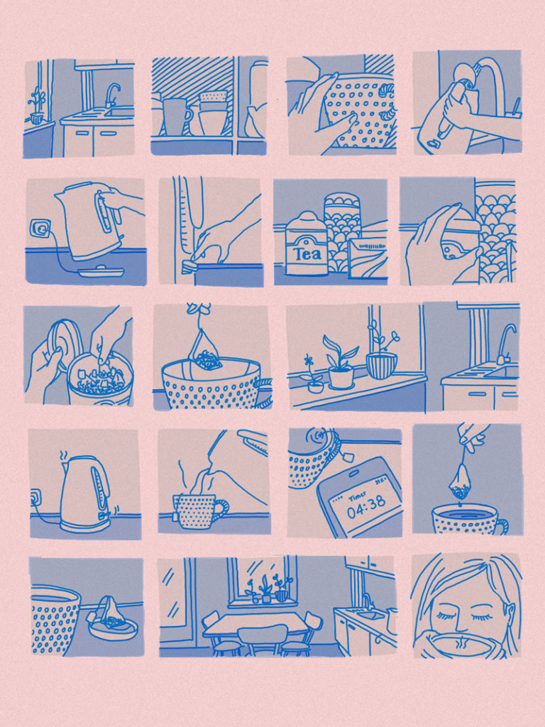
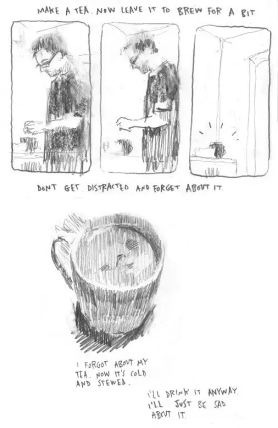
Encouraged to apply this to my chosen keyword I picked a daily routine (making tea) and structured the activity as a silent comic by breaking down the different steps.


Sketch: daily routine of making tea – A. Shemilt


Color 1. Daily routine of making tea – A. Shemilt


Color 3. Daily routine of making tea – A. Shemilt


There is still room for experimenting, not only with the theme but also with form and style. The idea that is growing slowly in the back of my mind is to combine the aspects from Taarika John’s approach with artists portrayed in Daily Rituals: How Artists Work by Mason Currey. Possible outcomes could be book illustrations or a series of posters. Work in progress!

I learned that even with the absence of words or a preset storyline in comics there are different ways of suggesting subtle narratives. By providing just enough visual information through colour and composition I can evoke potential narrative layers and have the viewer fill in the (visual) gaps. To my own surprise I discovered that I don’t have to have a meaningful meassage as a starting point. This was and still is a bit of a learning curve for me to trust the ongoing process enough that some way or the other an idea will develop.

I benefited from researching other artists and their works and by doing so I began developing an interest for silent comics; something that was not on my horizon before and something that I would like to explore further in the future.


On Silent Comics

In this post I reflect on silent comics. This was triggered by my visual research for my keyword project. I found a well researched blog entry by Thal Sneddon, that I will re-blog here (in parts). Sneddon is a freelance writer with a Master in Comic Studies.

From: The Silent and the Sequential: Wordless Comics (Sneddon, 2015)

“When we go with Scott McCloud’s definition of what makes a comic – “Juxtaposed pictorial and other images in deliberate sequence, intended to convey information and/or to produce an aesthetic response in the viewer” – we see that words are not required, though the distinction between “pictorial” and “other images” does imply a perceived hierarchy. Eisner requires only that a comic is “sequential art”, acknowledging that a comic without words is possible but cautioning that “sophistication” on the part of the reader is required.

In wordless comics dialogue is absent but narration is not. The lack of words means that the reader has to piece together the story, and even then, much is subjective and open to interpretation.

Unlike film or television where we simply receive the visual and audio communication, or even a book where we supplement what we are given with what we imagine, a comic actively requires us to move the characters, backgrounds, action or inaction, between what we are shown. In a wordless comic further clues are removed, making the read even more of a subjective and personal experience.”

Some examples:

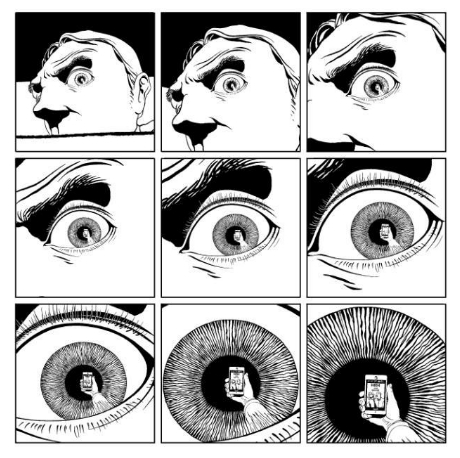
Marc Antoine Mathieu: 3″


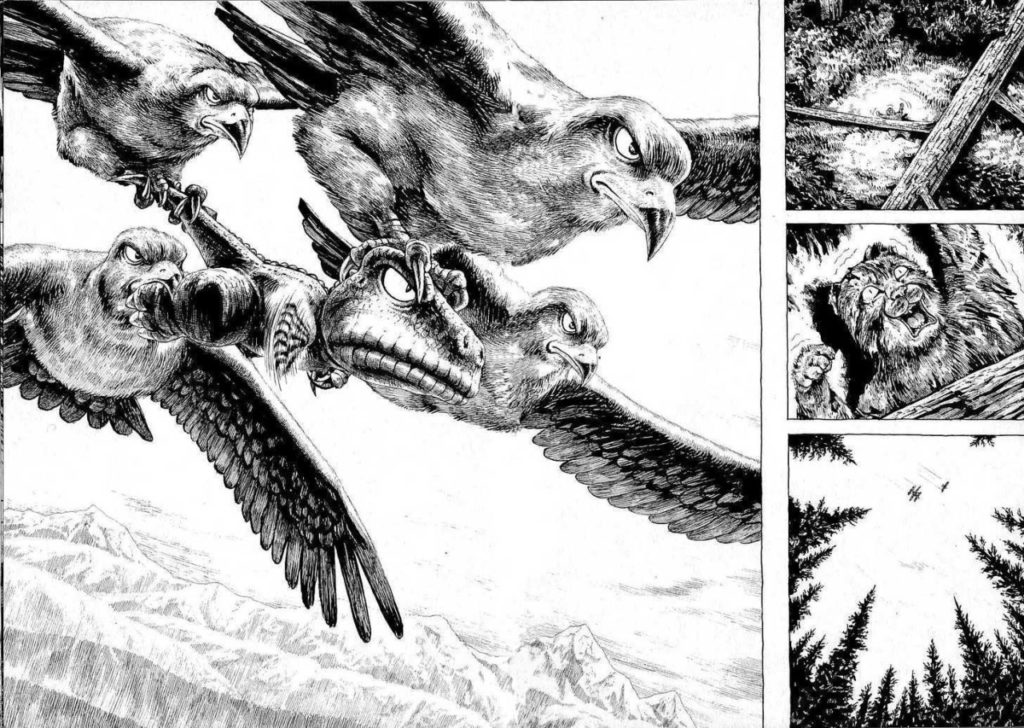
Masashi Tanaka: Gon

In the article “Silent Comics” (Postema, 2016) the Barbara Postema, argues that the “wordless genre allows the comic to create a space that pushes the visual register to communicate in more intricate and varied ways. Wordlessness can allow the image to push beyond representing the visual diegesis in some kind of mimetic way: in addition to the visible world, the imagery is expanded to represent other sensations, including sound and its qualities and dynamics.”


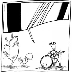
Great examples for representation of sound in a ‘soundless’ comic:

Joseph Lambert: ‘Keep it steady, turtle.’


“Due to the absence of dialogue, often the narratives of silent comics remain somewhat indeterminate, or lean towards the symbolic.”

This really resonates with me. Often I don’t have the confidence to make up a story or I would feel too embarrassed about it. Learning to develop pictorial narratives without relying on words can be just as powerful. This also leaves enough room for the reader’s own interpretation and frees me from the pressure of having to pick a specific message.


SNEDDON, T. (2017) The Silent and the Sequential: Wordless Comics [Online] January 20th 2015. Available from: comicbookgrrrl.com http://www.comicbookgrrrl.com/2015/01/20/the-silent-and-the-sequential-wordless-comics [Accessed: 28 November 2017].


Postema, B. (2016) Silent Comics. In: Bramlett, F., Cook, R. & Meskin, A. The Routledge Companion to Comics. London: Taylor and Francis.


Jon McNaught

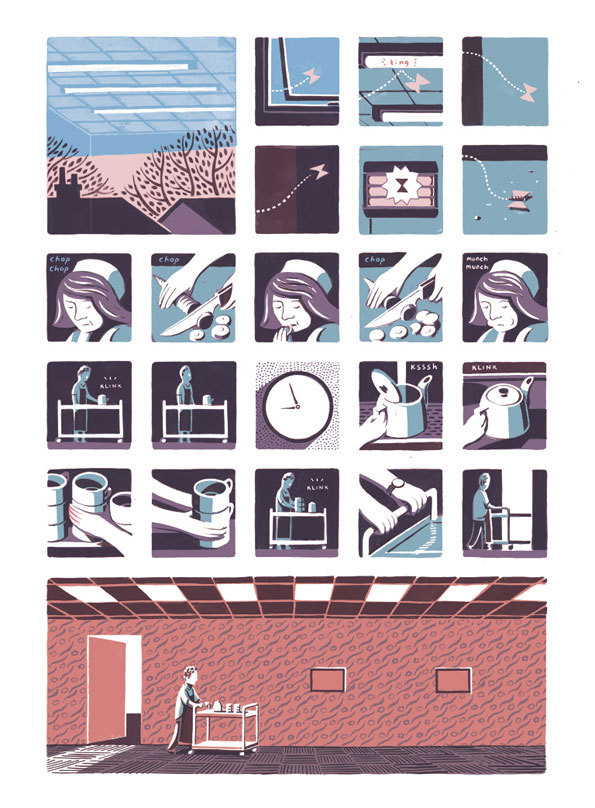
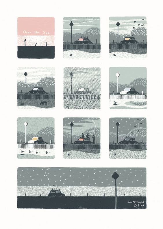
In this post I reflect on Jon McNaught’s work. A printmaker and illustrator from England, he uses screen-printing and lithography to create miniature images and silent narratives, depicting quiet moments from everyday life in small, often tile like panels. His inspiration is taken from his local surroundings and the British landscapes. Intrigued by Japanese woodblock prints (e.g. Hiroshige) as a student, he became interested in printmaking in order to recreate the displayed atmosphere.

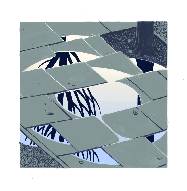
‘Puddle’, Lithographic print (2012)
From ‘Dockwood’. McNaught’s third comic book published by Nobrow Press 2012
Over the sea. Screenprint (2009)

His (mostly) silent comics are almost completely void of text and convey an atmosphere that I find very appealing. It is the simplicity he uses in form and colour that resonates with me and that lead me to discover those quiet narratives that I didn’t perceive at first. By combining the visual elements with sound elements specific to the place he adds another sensory layer, which, in addition to the absence of a clear plot makes the reader feel as if he was discovering and experiencing the depicted moment.

His narratives “are less concerned with plot, drama or action than capturing melancholic moods and ephemeral plays of light and shadow, connections and contrasts between the man-made and natural worlds, and the extraordinary in the ordinary.” (Paul Gravett, 2011)

I was happy to find a video from Bezalel Academy of Arts and Design. In this workshop he talks about his background, motivation and process. I have watched it several times already 🙂

Additionally there is an interview with Paul Gravett from 2011.

Gravett, Paul (2011) John McNaught: Printing Comics [Online] May 8, 2011. Available from: http://www.paulgravett.com/articles/article/jon_mcnaught [Accessed: 21st Nov 2017]

Bezalel Academy of Arts and Design, Jerusalem (2014) [Online] March 26, 2014. Available from: https://archive.bezalel.ac.il/skn/c6/בצלאל/Search#search=05bbe54a2b9efe8ced6dd6db7792bdbe

Hourly Comic Day

After a tutorial with Thom Cuschieri I felt encouraged to look into some directions he had pointed out to me in terms of comics and “daily”.

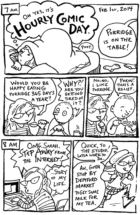
Called ‘hourly comic day’ this art project was started by John Campbell and takes place every year. The concept is simple: Comic artists and illustrators who want to participate draw a short comic, even just a panel, for every hour they are awake and load the results onto their blog or any social media platform they see fit.

It is a great way to discover new artists and take a look at what they are up to. Without a doubt this is also a great drawing and writing exercise as well as a creative challenge.

For me it was fascinating to see the different angles artists choose to depict moments from their everyday life.

Some interesting examples:


Joe Decie


Sarah McIntyre


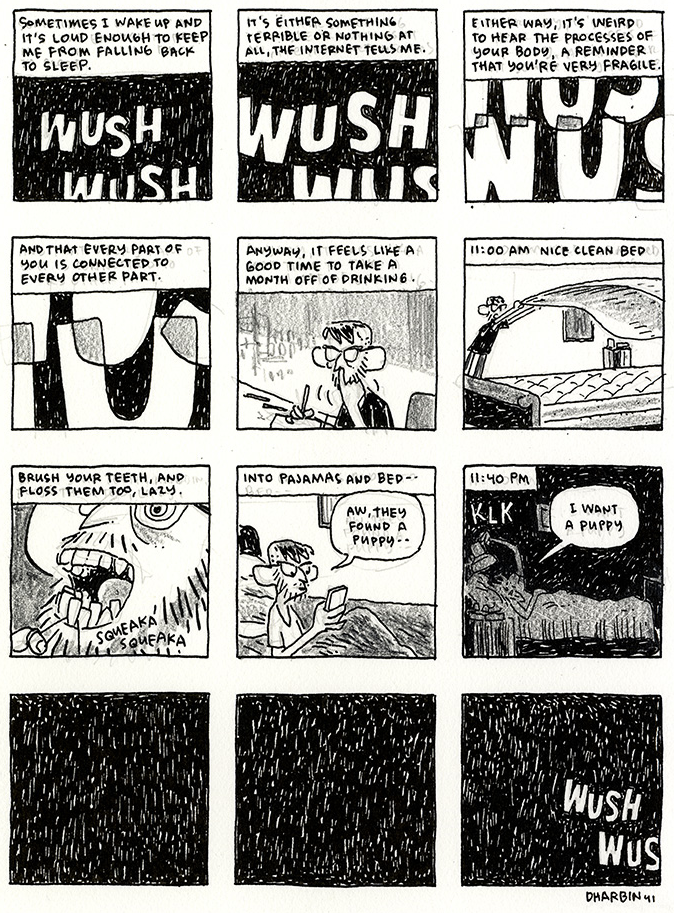
Dustin Harbin


Interview with Comic artist and letterer Dustin Harbin: SAVA, O. (2015) ‘Diary Comics’:


Dustin Harbin on the art of autobiographical comics and lettering [Online] Available from: http://herocomplex.latimes.com/comics/diary-comics-dustin-harbin-on-the-art-of-autobiographical-comics-and-lettering/#/0 [Accessed: 24 November 2017]

Decie, J. (2017) What I drew [Online] Available at: http://www.joedecie.com [Accessed: 24 November 2017]

Hickey, A. (2017) Andrea Hickey [Online] Available at: http://www.andreaghickey.com [Accessed: 24 November 2017]

McIntyre, S. (2017) Hourly Comics [Online] Available at: https://www.jabberworks.co.uk/hourly-comic/ [Accessed: 24 November 2017]


Comics Alliance (2017) 17 webcomics diaries that let you peek other people’s life. [Online] Available from: http://comicsalliance.com/autobio-diary-comics-webcomics/ [Accessed: 24 November 2017]

“Souvenir”– Martin Parr

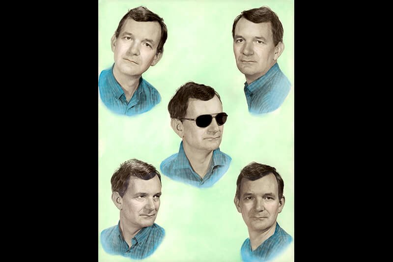
From ‘Common Sense’. Munich. GERMANY 1997 © Martin Parr / Magnum Photos

The other day I went to a photography exhibition: “Martin Parr. Souvenir – A Photographic Journey”. Though I had seen some of Parr’s photographs a few years back I did not expect it to be so entertaining and yet so thought provoking at the same time.

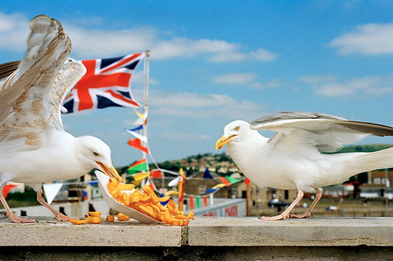
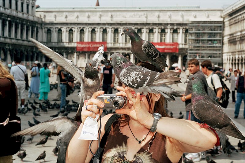
Though “the motifs he chooses are strange, the colours are garish and the perspectives are unusual” (curator Thomas Weski) they made me think about the respective situation at hand in the photographs because they offered a strong statement of current society. Thus they don’t just look interesting, funny or sometimes even depressing but they become meaningful.

My take-away for my own work: Finding the extraordinary in the ordinary, especially in regard of my chosen keyword ‘daily’. Reflecting on what is at hand in terms of drawing motifs and injecting them with meaning.


From ‘Autoportrait’. CUBA 2001 © Martin Parr / Magnum Photos und Kunstfoyer


From ‘Think of England’. GB 1996 © Martin Parr / Magnum Photos und Kunstfoyer


From ‘Small World’. ITALY 2005 © Martin Parr / Magnum Photos und Kunstfoyer


Generally speaking I love going to photography exhibitions because they are not only a great resource for inspiration but a great practice to analyse composition, structure and underlying aesthetic principles. If a specific picture really draws my attention I try to capture why that is and then later, if for example I work on a cover design I try to translate this knowledge into my own work.

About Martin Parr from the Magnum Photos website:

“Martin Parr is a chronicler of our age. In the face of the constantly growing flood of images released by the media, his photographs offer us the opportunity to see the world from his unique perspective. At first glance, his photographs seem exaggerated or even grotesque. The motifs he chooses are strange, the colours are garish and the perspectives are unusual. Parr’s term for the overwhelming power of published images is ‘propaganda’. He counters this propaganda with his own chosen weapons: criticism, seduction and humour. As a result, his photographs are original and entertaining, accessible and understandable. But at the same time they show us in a penetrating way how we live, how we present ourselves to others, and what we value.” – Thomas Weski, curator.


Versicherungskammer Kulturstiftung (2017) MARTIN PARR. Souvenir – a photographic journey [Online] Available from: https://www.versicherungskammer-kulturstiftung.de/en/kunstfoyer/martin-parr-souvenir-a-photographic-journey/ [Accessed: 22 November 2017]

Magnum Photos (2017) Souvenir – a photographic journey [Online] Available from: https://www.magnumphotos.com/events/event/souvenir-a-photographic-journey/ [Accessed: 22 November 2017]

Why graphic recording appeals to me

From time to time I catch myself flirting with the idea of giving graphic recording a go. It is fast, intense and it requires little, if any post editing. According to the article The Big picture (Breselor, S. (2015) ‘The Big Picture’. Communication Arts 56. pp. 24-27., also available from www.commarts.com/columns/the-big-picture) my tasks would be to “synthesize a constant stream of information in real time, select and sketch only what is most insightful and relevant, all while in front of an audience.“ As challenging as this might sound there is a liberating angle to it. I am left in complete control over every line I draw on a white board or paper and all discussions with clients and art directors are rendered obsolete. Any artistic ambition is surrendered to a literally bigger picture since graphic facilitation and recording is not about aesthetics but communicative power and purpose. Applied strategically it can “facilitate meetings and conversations or answer questions that are not manifestly pictorial in nature.” (p. 27)

In context of the MA programme I find the article very encouraging. It is a valuable reminder of the power of the visual mind and the ability to create meaning through images.


Breselor, S. (2015) ‘The Big Picture’. Communication Arts 56. pp. 24-27.

Online:

Communication Arts (2017) The Big Picture [Online] Available from: https://www.commarts.com/columns/the-big-picture [Accessed: 4 November 2017]

Visiting the Frankfurt Book Fair 2017


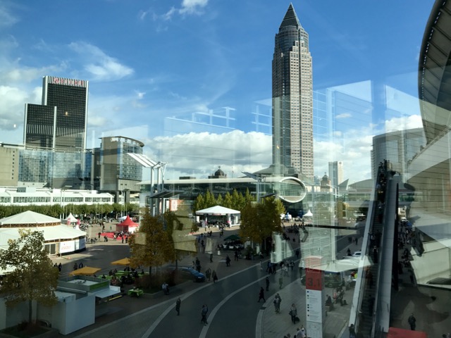
Book Fair at Frankfurt Exhibition Centre


A few weeks ago a friend and colleague suggested I join her and visit the International Book Fair in Frankfurt, Germany. The largest international event in the book and media world is a great opportunity to both get a broad overview of current trends in book design and illustration as well as connect with  interesting people such as publishers, writers, illustrators, designers and editors. Needless to say, this visit had the potential to provide an enormous inspirational and creative boost!

(It was very rewarding to discover among all the new publications some books that I had designed and that were on display at the respective booths.)

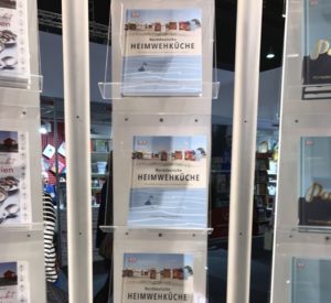
Norddeutsche Heimwehküche (Northern German Comfort Food), Dorling Kindersley


Together with a friend, Pina Gertenbach, a published children’s book illustrator we dove into the world of books and images – which, I admit, was overwhelming at times considering the vast amount of new and beautiful publications on display!

Unlike her I didn’t have any scheduled appointments with editors or publishers but intended to simply allow myself to browse new titles within the topics of design practice and theory, creative thinking, and illustration. Always on the lookout for new angles and approaches to my practice combined with the given assignment on the MA programme to challenge established routines and methods, I came across the following books: 

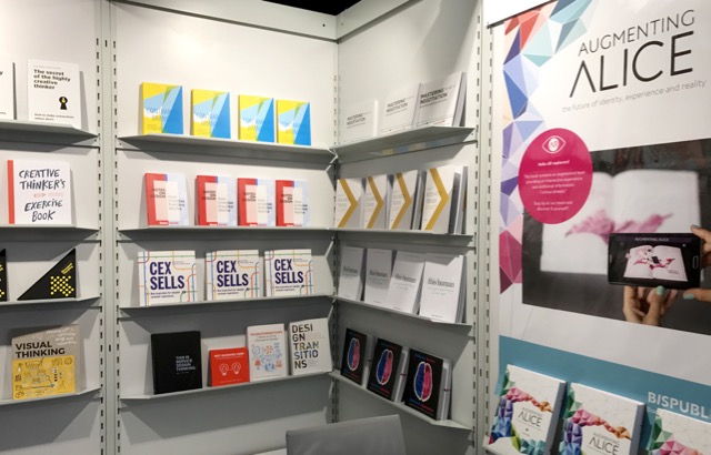
Notes on Design and How to Research Trends


Booth: BISPublishers, Netherlands


Later Pina introduced me to Niklas Thierfelder, who runs the publishing house Kunstanstifter in Mannheim, Germany, where she had her first book published. 

Kunstanstifter Publishing House was founded in 2006 by Suse and Niklas Thierfelder in Mannheim. Together, we decided on a daring venture – publishing illustrated books apart from the mainstream, art that charts new frontiers, fresh and provoking, smart and masterly crafted. Our vision grew into an award-winning, independent publishing house.”

I’m still processing an information-overload of different visual impressions and conversations.

My conclusion is that I definitely intend to re-visit the Frankfurt Book Fair in 2018. It is invaluable to talk to people in the industry in person and experience the vibe and overload of information first hand. However, I would select and research potential clients/publishers beforehand and then try and schedule appointments, so as to make the most of my next visit.


Kunstanstifter Verlag für Illustration (2017) About Us [Online] Available at: https://kunstanstifter.com/about-us/ [Accessed: 28 October 2017 ]