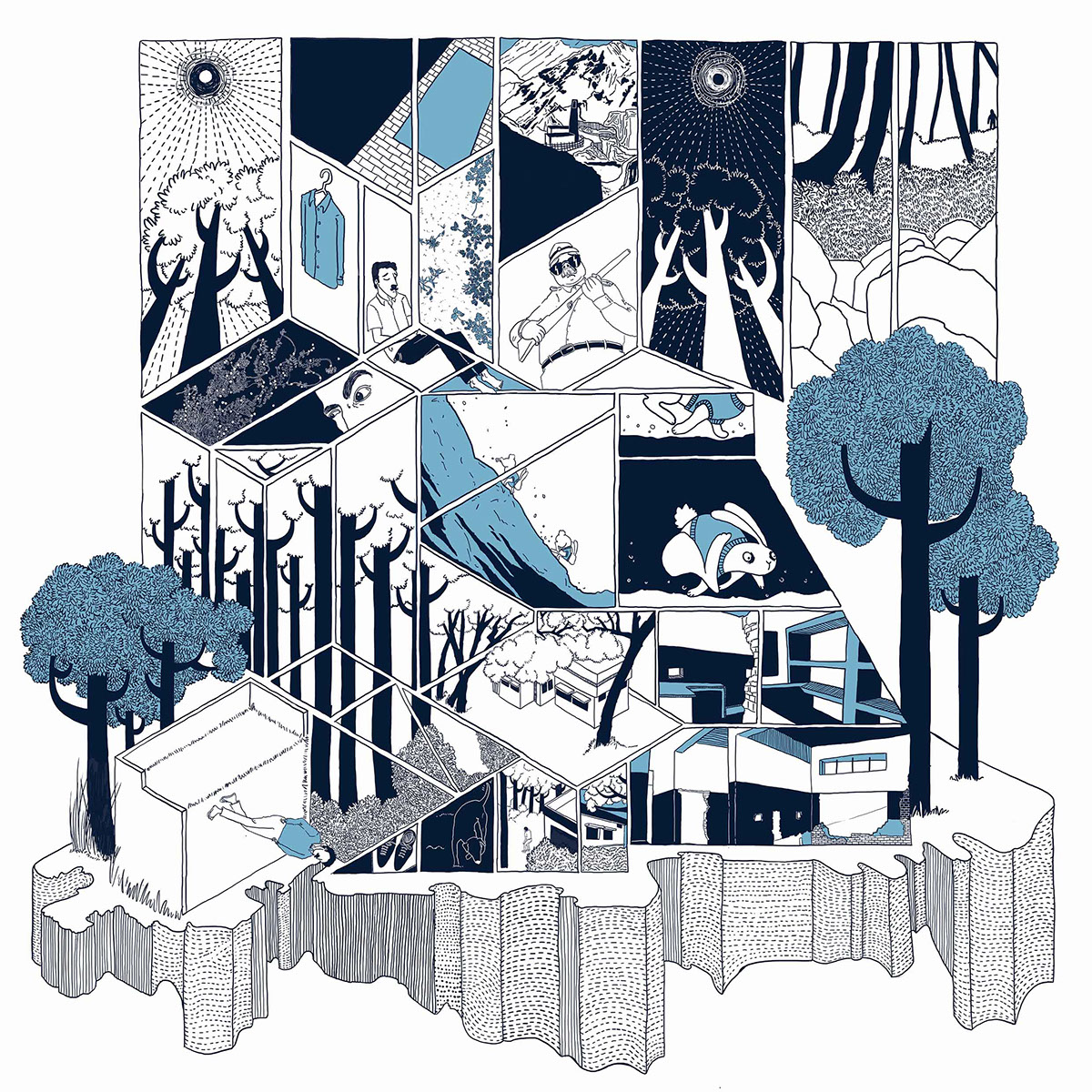
Today I reflect on a few aspects of a catalogue that accompanied the exhibition Japan: Modern. Japanese prints from the Elise Wessels Collection.
Even though I didn’t have the time to see the original prints at the Rijks Museum in Amsterdam last year, I did manage to buy the catalogue from the museum store. (Museum stores are great places to find all manner of superb books).
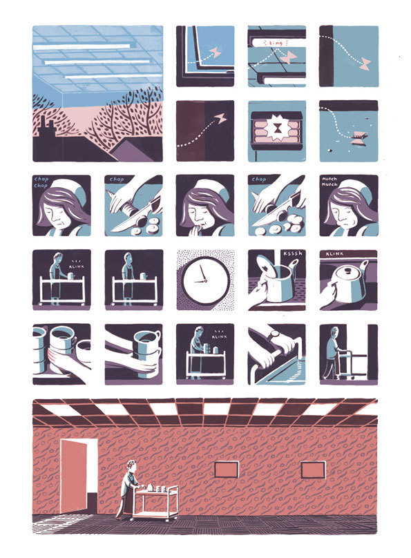
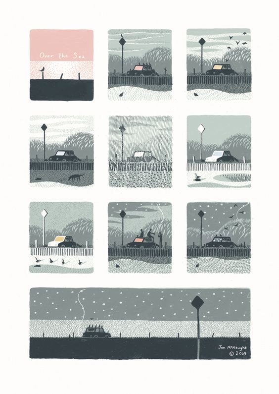
I have been a fan of Japanese aesthetic and culture for quite some time and I was delighted to read (and see) during my research that Jon McNaught, an illustrator of whose work I became fond of and have outlined in a different post, talks about his early fascination with Japanese printmaking. But of course, it goes without saying that Japan has been an important source of inspiration for many people.
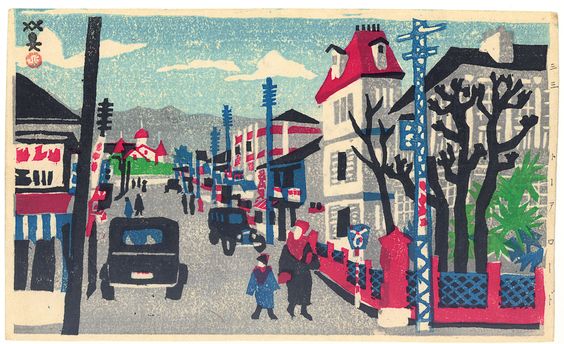
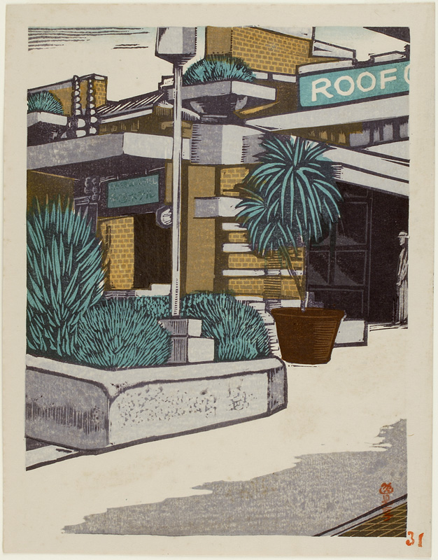
The show introduces Japanese printmaking from the first half of the twentieth century, with the emphasis on the first three decades. The experienced rapid growth of industrialization and modernization, caused great changes in landscapes and social relations. Artistic expression of the emotional responses is represented by two movements: sosaku hanga (creative prints) and shin hanga (new prints; contrary to the name they are basically a continuation of the classical tradition of ukiyo-e printmaking)
Some examples from the collection:
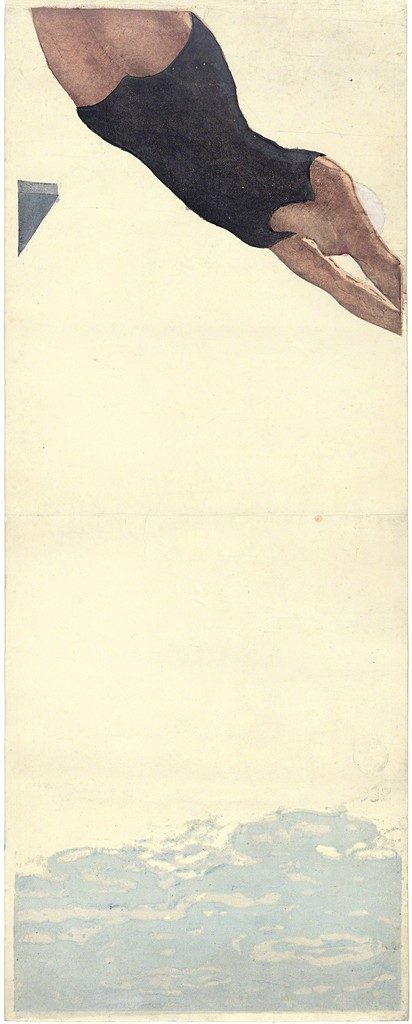

Both movements used the same medium but had very different ideas about application, artistic practice and choice of theme. The more conservative shin hanga artists would work under a publisher’s supervision, rendering highly refined products and depicting traditional themes such as the female portrait and atmospheric landscapes. Sosuka hanga artists promoted the idea of an artist as being in charge of the print’s production steps, which often resulted in a more crude outcome with less details. They focused on their immediate surroundings and daily life as motifs.
In reality the distinction between both movements was not as strict. Often artists would create templates for a publisher and would then also be responsible for the printing process.
My reading up about this part of art history and about artists’ sources of inspiration is like tracing back a dynamic chain reaction being in constant movement. It is fascinating to actually see the influences of Japanese “art”, seen as it wasn’t even considered as art in Japan when these prints became hugely popular in the Western world. One of the most famous and obvious examples on how influential these Japanese visual techniques were, is some of Vincent van Gogh’s work.
The van Gogh museum’s website renders this aspect beautifully: Meet Vincent. Inspiration from Japan
Van Gogh Museum (2017) Meet Vincent. Inspiration from Japan. [Online] Available at: https://www.vangoghmuseum.nl/en/stories/inspiration-from-japan [Accessed: 11 December 2017]
Jansen, M. (2016) Japan: Modern. Elise Wessels Collection published on the occasion of the exhibition at the Rijks Museum, Amsterdam: June 24 – September 11, 2016. Amsterdam: Rijks Museum
Rijksmuseum (2017) Japan: Modern. Elise Wessels Collection [Online] September 2016. Available at: https://www.rijksmuseum.nl/en/japan-modern [Accessed: 11 December 2017]
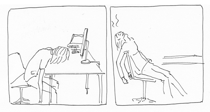


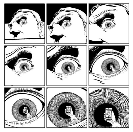
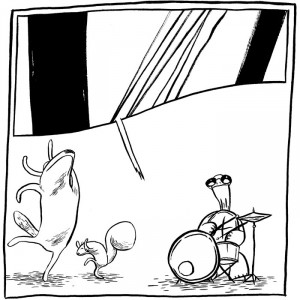

 Dustin Harbin
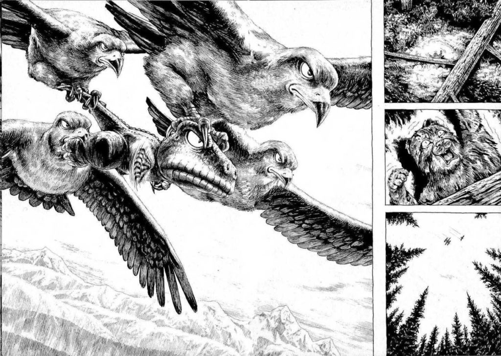